Wanci Zilaiye V1.0.2 is out
Android and Mac (Intel and M-series). Works offline. Zero permissions, no network, no private data.
Ever since Wanci Zilaiye (a vocabulary app based on etymology) shipped V1.0.1, Aubzhang has had something hanging over him.
Building a product is like raising a kid. Birth is only step one. A while back, friends started using the app and messages trickled in.
One of them was brutally direct: "Aubzhang, the etymology breakdown is great, but every time I sit down to study, I'm facing thousands of words. I quit, come back, and I have no idea where I stopped. I just flip around from memory."
User feedback must be heard and taken seriously. That's an iron law of product management.
But how do you solve it? Hence today's story of Aubzhang going head to head with AI.
1. A Product Manager's Restraint: Solve This One Problem Only
Feedback in hand, Aubzhang immediately pulled AI in to evaluate.
As an old product hand, he knows: any new feature starts with market research. Research done, he found the mainstream apps all solve it with either "auto-record browsing position" or "a separate vocabulary notebook."
Referencing competitors is good, because their features have already been market-tested — following along saves detours. But this time Aubzhang was extremely unhappy with what AI proposed after looking at competitors.
AI suggested: auto-remember the last position, make it a lightweight bookmark.
Aubzhang vetoed it outright: user click paths are scattered! A user might look at A, jump to B, come back to A. A machine can never guess the real progress.
At the same time he set a hard rule for this upgrade: solve only the "find my last position" need. Scope and ship date revolve around that one need. No greed, no feature creep.
2. Micro-Innovation: The Smaller the Change, the More Skill It Shows
When settling on an approach, Aubzhang held to one principle: disturb the habits users already have as little as possible.
Optimize interface elements and features in small doses, repeatedly. Stretch the timeline out across versions, adjust gradually, let user habits transition naturally, and eventually quantity turns into quality.
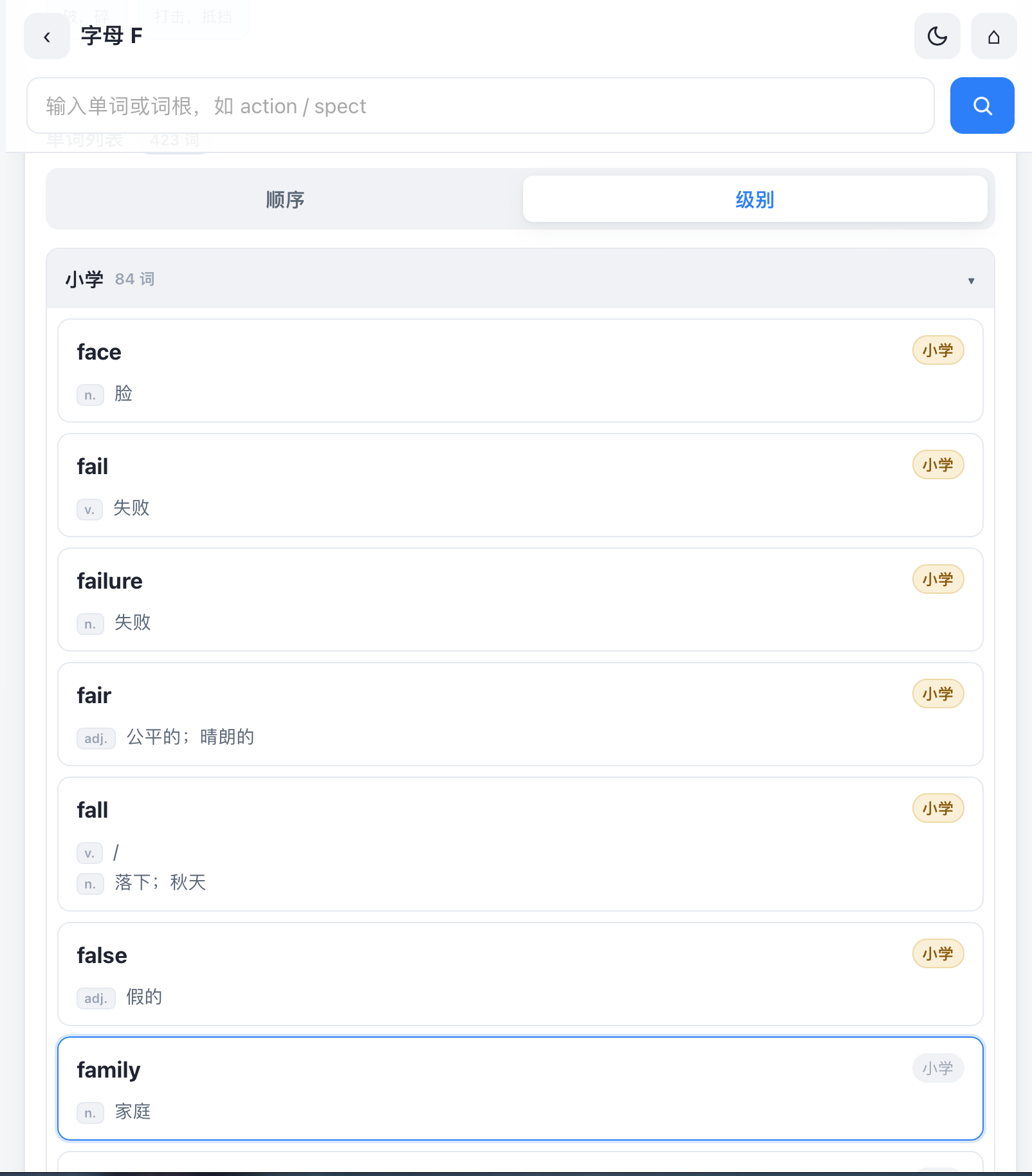
After repeated walkthroughs, Aubzhang picked the lightest possible approach: change only the color of the "level" tag (primary, middle school, high school…) next to each word in the list. Tap once, that's a check-in. Tap again, it's cancelled.
3. A Color Argument, Both Sides Digging In
If it's going to change color, which color? Aubzhang had AI render comparison mockups of three real scenarios.
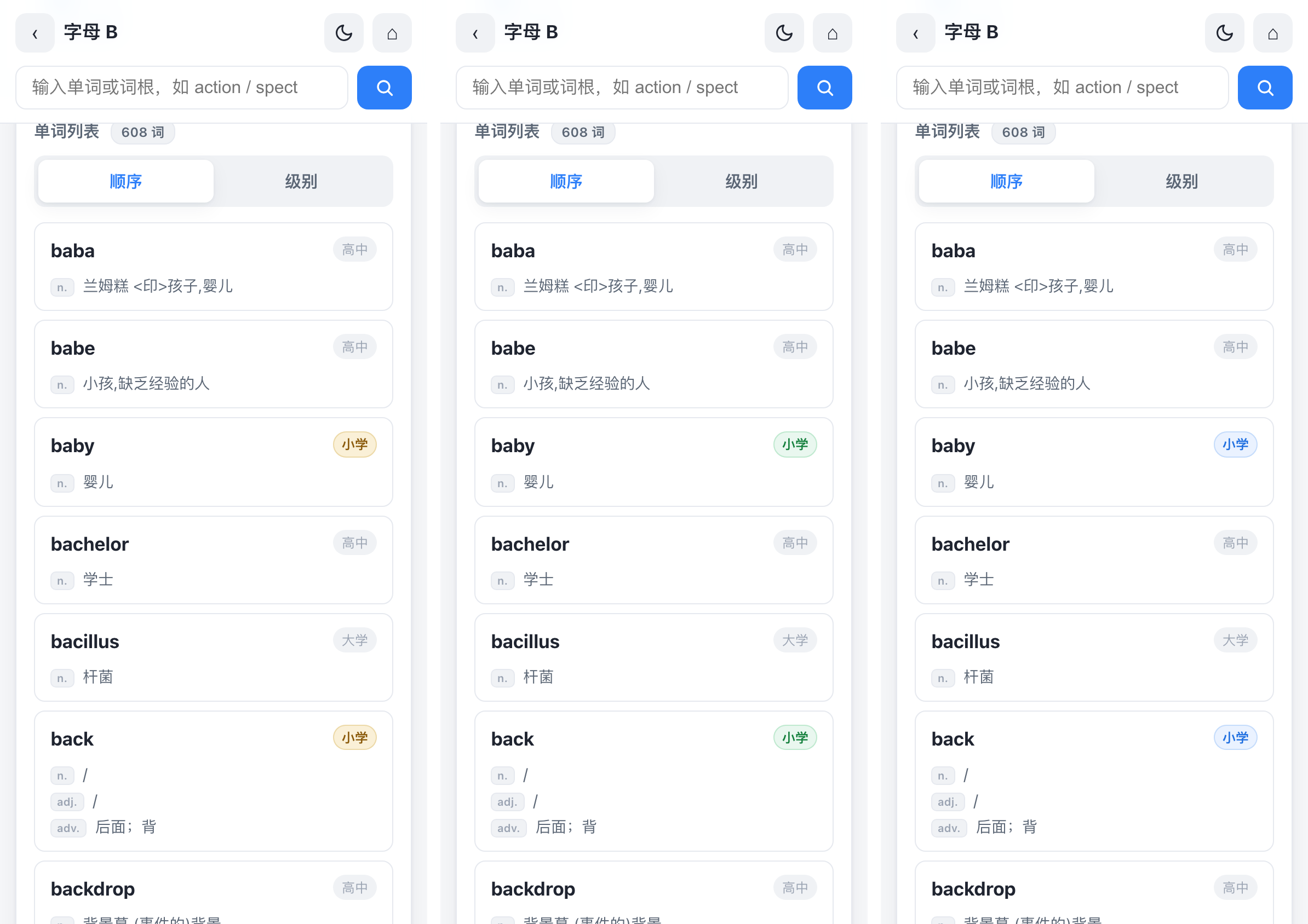
Guess which one won? "Noble Yellow."
Here's Aubzhang's reasoning:
- Blue: his primary color, steady — but the page already has a blue highlight frame at the bottom. Tags turning blue too would confuse the visual read.
- Green: high brightness, extremely eye-catching, but here it's too abrupt.
- Yellow (crown color): pale gold background with dark brown text — in a user's mind, yellow naturally means achievement and crown. The lowest possible learning cost. Seeing a gold tag feels like receiving a check-in badge.
4. The Highest-Level Solution: Convert the Need Away
Feature built, and Aubzhang still wasn't satisfied.
The truth is, a user's insistence on "where did I stop" is fundamentally progress anxiety. The highest-level product thinking isn't satisfying the need directly. It's guiding the user toward a better way of using the thing.
So Aubzhang didn't build a rigid "bookmark." He built an achievement display system.
Where you stopped matters far less than the quantity and quality of what you've memorized. When a user opens the list and sees a sea of gray dotted with patches of bright Noble Yellow, they instantly see what they've learned and what they haven't.
They naturally continue into the gray zones without achievement marks. The "find my position" need got quietly converted into a new need: "find my next achievement."
5. Engineering: The Grinding Nobody Sees
Good design still lands on lines of code. In between, Aubzhang hand-drew a separation zone and had AI solve two extremely hard engineering details:
- Perfect mis-tap prevention. Previously, tapping anywhere on a row opened the detail page. Now tapping the "level tag" is a check-in. Aubzhang drew the blueprint, had AI precisely expand the hit area with pseudo-elements, and stop event bubbling. Tap exactly what you aim at, no accidental triggers.
- Cross-device packaging landmines. This version landed while Aubzhang was at the office, and the environment was missing a JDK. He went home that night, built the v1.0.2 APK, extracted the keystore, and went back the next day to bring both platforms in line. Signatures (v1+v2+v3) all green, fingerprint identical to 1.0.1 — install right over the top, and none of your check-in data is lost.
6. Final Thoughts: What Is a Product, Really?
Through this upgrade Aubzhang thought one thing all the way through: what is Wanci Zilaiye, actually?
A vocabulary check-in tool? A dictionary?
Its essence is — an exploratory English-learning tool built on etymology comprehension.
Which is why this version deliberately skips a complex achievement system (leaderboards, daily check-in counts). Plenty of users treat it as an English dictionary, and Aubzhang doesn't want it turning into a game where you check in for the sake of checking in.
But if one day a large number of users genuinely need a stronger check-in system? Then Aubzhang will listen.
A product is always co-defined: the developer sets the direction, the users vote with their feet.
The new V1.0.2 is up on the site: aubzhang.com
Core update: the new Noble Yellow check-in tags, perfect mis-tap prevention, install straight over the old version.
Go try it. May your English-learning road hang full of noble gold badges.